I had more big orders recently that warranted Extra Special Pretty Packaging. My first attempt at DIY packaging was pretty good I thought, and until I become world-famous enough to commission a whole suite of branded products, I will continue to get my crafty mojo on and package items myself.
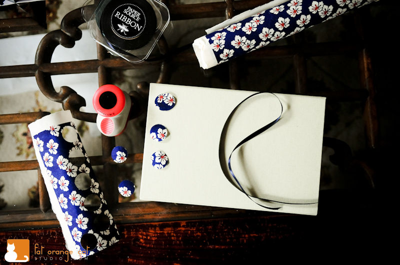
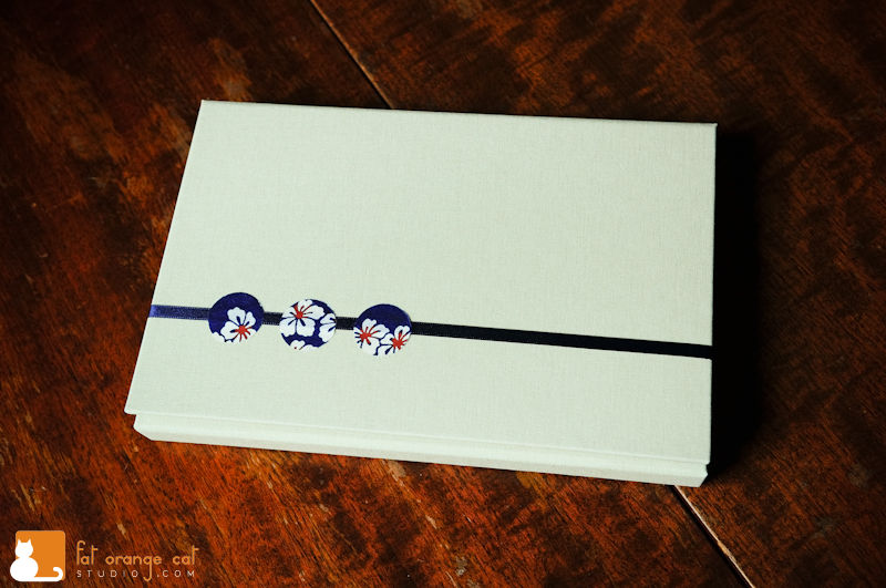
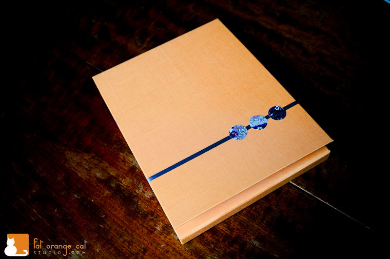
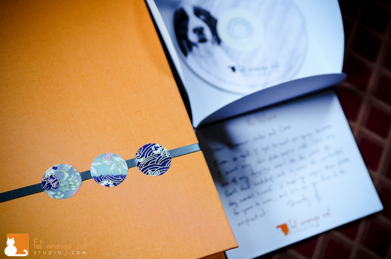
This time I kicked it up a notch. I punched circles out of pretty Japanese paper (I have a collection of them, love paper) using my handy circle puncher. Glued a strip of navy blue satin ribbon around the outside of the box, and then glued a trio of the paper on top.
Everything is from Paper Source – the circle puncher, the ribbons, the Japanese paper, the petal envelopes, the A9 and presentation envelopes (for 5×7’s and 8×10’s respectively), the portfolio box thingy…I have no idea what they’re called officially, but they’re like stiff cardboard boxes covered in book cloth, and there is a little pocket inside.
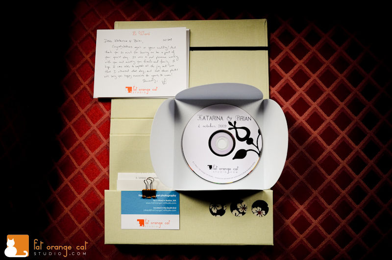
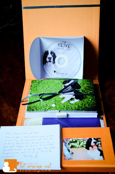
The boxes come in a variety of sizes and colors. I saw these smaller ones and thought they would be perfect for one-off items such as a CD/DVD. The box above is for the couple whose wedding I photographed at the beginning of the month. It contains the DVD, a print release letter and a thank you card. And biz card of course.
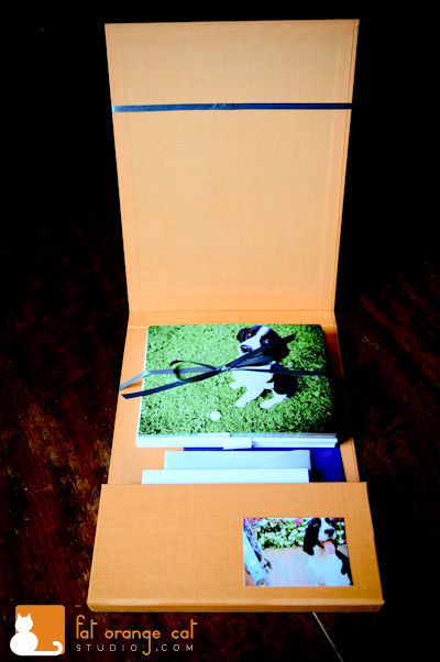
The box below is for Clive the Springer Spaniel. I check in regularly to Paper Source for new ideas/inspiration and was excited to see a small stack (2 only!) of ORANGE portfolio boxes. I quickly snatched them up. The ribbon color for this is teal, and I used a different sheet of Japanese paper to go with it. It has bits of teal and navy in it as well. Excuse the horrible lighting. It’s been dismal around these parts.
The stack of Clive notecards didn’t fit in the slot, so I placed it above and secured the stack in place with a rubberband, which I then concealed with satin ribbon, tied in a bow.
Clive is also getting 3 huge Mounted Prints which I can’t wait for them to see. I usually find that my favorites are not at all aligned with the clients’ favorites. But here, Clive’s owners picked 3 of my favorite images to blow up – all of which I consider a little “artsy” and unconventional.
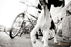
In fact, a rep from the pro print lab called me to make sure that bike image selected was in fact correctly cropped — why yes most of Clive’s head is cut off. That’s straight out of the camera, so hit the presses!
All packaging materials from Paper Source, except
:: my business cards – moo.com “green” business cards
:: Letterpress notecards – Parrott Design Studio
:: CD/DVD label – designed and printed by me on Avery CD labels

I just adore the way you package your orders! Better than a box of chocolates.
Everything looks amazing, Li!!
LOVE the packaging! I might have to get the circle puncher and some (more) Japanese fabric prints… one can Never have too many…
You’re so crafty… I’m sure your clients are stoked to receive those pretty packages…
Li, these are great! And so cool! I think it makes it so much more personal. Each and every client gets their own packaging- neat!
These are so pretty, Li! The call from the printer is cracking me up!
Your packaging is beautiful! I love the 3 circles on the top of the box!
Awesome job!
Hey Li! I’ve been looking for creative packaging ideas and I LOVE Paper Source, but I had no idea about the boxes. I’m going to try out a version of this design for my new photo business. I’m at the same place where I can’t have a whole suite professionally designed, but I want something nice for my clients. Thanks so much for the inspiration.
Would you mind if I asked about what each packaging arrangement costs, total?
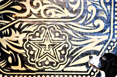
Also, that photo of Clive with his head poking out by the OBEY star… Love. It.